
Canvas Deep Dive
Data Visualization Using Lines, Dashes, Dots & Arrows
with lineCap, lineJoin, setLineDash, lineDashOffset & miterLimit
 by Joe Honton
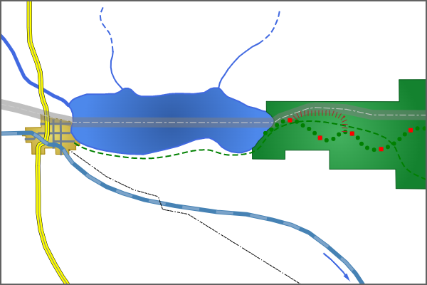
Cartography might easily be considered the world's most mature form of data visualization. Over the centuries, mapmakers have created and refined a sophisticated vocabulary of lines and symbols that convey relationships between objects and places. We can learn from their efforts.
From blobs of blue, to "x" marks the spot, to meandering lines, cartographers have a large tool chest of symbology to draw from. When reading a map for the first time, part of the fun is just marveling at its rich symbology — and to wonder what led the cartographer to choose those particular shapes, lines, signs and colors.
A full study of the art of cartography — what's possible, what's been tried, what succeeds and what fails — would be fun. But for now, let's leave aside the blobs and spots. Instead, let's focus on lines, and explore some of their possibilities for browser-based data visualization. In particular, let's see what we can do with HTML's canvas feature.
I've been developing canvas-based components for more than a decade. One of my first uses was to display ionizing radiation measurements across Japan during and after the Fukushima disaster. The resulting effort was published as a dynamic Voroni map which can still be seen at fukushimafallout.info. That early effort gave me the confidence to work on increasingly sophisticated projects.
During my work with HTML canvas, I've encountered some challenging problems. Some of these were due to poor tutorials, others were due to undocumented features. Here I share some of my discoveries for those who are still struggling to get beyond the basics. My hope is that I'll see more people using these techniques in creative ways to improve the field of data visualization.
Canvas & context
So that we're all starting from the same point, let's review the basics. Once we've established that, we can build upon it to explore more advanced techniques.
First, all drawing in HTML is done on a canvas element like this:
<html>
    <head>
        <title>Data Visualization Using Lines</title>
    </head>
    <body>
        <canvas id=map width=600 height=400></canvas>
        <script src='./map.js'></script>
        <script src='./helper-functions.js'></script>
    </body>
</html>
For most purposes, this sample will suffice. The only caveat here is that the width and height must be specified using HTML properties. CSS width and height values should not be used.
Second, the canvas element uses JavaScript for its drawing instructions. To keep things clean, we'll place those instructions in separate files. Here they have been arbitrarily named map.js and helper-funtions.js.
Now, to get started, we'll define ctx to be the all-important context variable that is passed to every canvas function we use. We'll use that to begin building our line drawing codebase.
const ctx = document.getElementById('map').getContext('2d');
It's important to note that all canvas context values are "sticky", so subsequent drawing operations will use the most recently assigned values. Be sure to assign new values for each new drawing operation, or reset them to their defaults like this:
ctx.strokeStyle = 'Black';
ctx.lineWidth = 1.0;
ctx.lineJoin = 'miter';
ctx.lineCap = 'butt';
ctx.miterLimit = 10.0;
ctx.setLineDash([]);
ctx.setLineDashOffset(0.0);
Next, we'll look at how to use each of these context properties to draw distinctive features.
Paths and subpaths
The starting point for all line drawing techniques is the declaration of the points that define the line. For our examples, we'll use arrays of x/y values, although in practice these will often come from a JSON file or some external database.
Our definePath method uses three canvas functions: beginPath to clear all previously buffered coordinates, moveTo for the first point, and lineTo for all subsequent points. The hard part is defining the pairs of x/y coordinates that describe the line, and converting them into canvas coordinates. Remember: the top-left corner is {0, 0} and the bottom-right corner is {width, height}.
function definePath(ctx, pts) {
    ctx.beginPath();
    ctx.moveTo(pts[0][0], pts[0][1]);
    for (let i=0; i<pts.length; i++)
        ctx.lineTo(pts[i][0], pts[i][1]);
}
Every project will define coordinates in its own way — just be ready to get dirty with some basic algebra and geometry. For cartography, I use QGIS to create shapefiles, then export them as geojson files, which can readily be consumed by JavaScript. For other projects I use Inkscape, and export them as an "HTML 5 Canvas" file.
To assemble a line that has a gap, omit the call to beginPath on the second segment, start with a moveTo call, and continue with a sequence of lineTo calls. This is our defineSubPath function.
function defineSubPath(ctx, pts) {
    ctx.moveTo(pts[0][0], pts[0][1]);
    for (let i=0; i<pts.length; i++)
        ctx.lineTo(pts[i][0], pts[i][1]);
}
Stroke style & line width
To actually draw the defined path onto the canvas, we use the stroke function, which by default draws a black line one pixel wide. We must change the context's strokeStyle and lineWidth before calling the stroke function to get a different effect. Here's how we can draw a line representing a river.
// a wide blue river
definePath(ctx, riverPts);
ctx.strokeStyle = 'RoyalBlue';
ctx.lineWidth = 5;
ctx.stroke();
The strokeStyle can be assigned any of the predefined color names or any sRGB color space value (rgb, hsl, hwb, lch, lab) — use rgba or hsla to draw semi-transparent lines.
The lineWidth assignment is unitless, so don't use values that include a "px" suffix.
Junctures & endpoints
Lines are drawn as a sequence of straight segments between adjacent points. Each point on the line, except the two endpoints, will participate in two segments. The point where two segments come together is called a juncture.
We can choose how each two-segment juncture is drawn onto the canvas using the lineJoin property. It expects one of three possible keywords: round, miter or bevel.
For rivers and other natural features I use the keyword "round" to create graceful flowing turns. For administrative boundaries and other boxlike features that have obtuse angles (greater than 90 degrees) I use the keyword "miter" to create sharp corners. I use the keyword "bevel" for lines that have acute angles (less than 90 degrees) that need to be chopped off to look good.
The two points at the furthest ends of a line's path are not affected by the lineJoin setting because they are not junctures. Instead, they are drawn according to the lineCap setting. It can be one of three possible keywords: round, square, or butt.
I use the keyword "round" to create beautiful half-circle endpoints on natural features, and the keyword "square" for features like dead-end roads. The "butt" keyword is similar to "square" except it doesn't overhang the end of the line — choosing one over the other is mostly a matter of precision and alignment. In other graphic projects, such as when using lines to graph charts (as opposed to drawing with rectangles), "butt" is the better choice because everything aligns precisely.
It should be noted that each of the above settings will only be visibly noticeable when applied to thick lines. It's hard to see the difference when drawing segments that have a lineWidth that's less than 3.
Here's an example with multiple subpaths representing streets, showing how to properly apply crisp settings for junctures and endpoints.
// streets
definePath(ctx, street1Pts);
defineSubPath(ctx, street2Pts);
defineSubPath(ctx, street3Pts);
defineSubPath(ctx, street4Pts);
defineSubPath(ctx, street5Pts);
ctx.strokeStyle = 'SlateGray';
ctx.lineWidth = 3;
ctx.lineJoin = 'bevel';
ctx.lineCap = 'square';
ctx.stroke();
Arrowheads
When using the "miter" setting, there's also a complementary miterLimit property which can be used to draw the juncture of two segments with exaggerated effect. This is most meaningful when drawing acute angles, such as sharp pointed arrowheads.
To draw an arrow, separate the points of the shaft from the arrowhead itself. The shaft can be drawn using any of the techniques already discussed.
The arrowhead should consist of exactly 3 points. Thus, it will have two endpoints, subject to the lineCap setting, and one midpoint, subject to the lineJoin setting.
The magic behind the arrowhead is drawing the midpoint with a large miterLimit. How large? It depends on the angle created by the defining line's three points. As a general guide: for wide triangular arrowheads the value should be 2; for medium width arrowheads the value should be 3; for slender arrowheads the value should be 4. Larger values will have no effect; smaller values will chop off the arrow's tip.
Here's an example:
// arrow shaft
definePath(ctx, arrowShaftPts);
ctx.strokeStyle = 'RoyalBlue';
ctx.lineWidth = 2;
ctx.lineCap = 'square'
ctx.lineJoin = 'bevel';
ctx.stroke();

// arrow head
definePath(ctx, arrowHeadPts);
ctx.strokeStyle = 'RoyalBlue';
ctx.lineWidth = 3;
ctx.lineCap = 'square'
ctx.lineJoin = 'miter';
ctx.miterLimit = 4;
ctx.stroke();
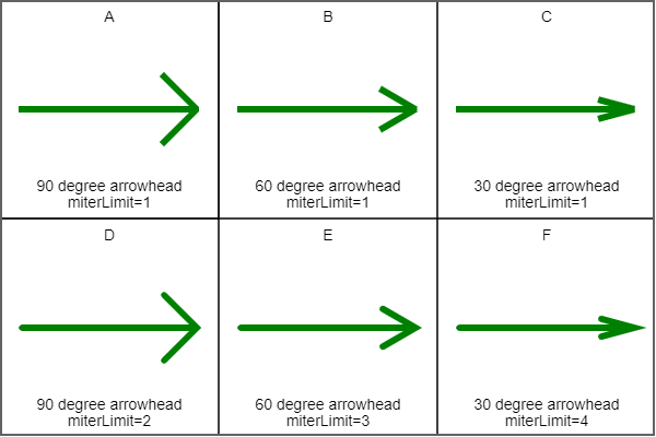
Panels "D", "E", "F" use a different miterLimit for each arrow, suitable for the given angle, that
allows the full arrowhead tip to be drawn. All panels use lineJoin="miter".
Dashed lines
Some map features are traditionally drawn using dashed lines. This can be accomplished with the setLineDash function. Unlike the other properties demonstrated so far, setLineDash is not a simple property assignment, rather it is a function that accepts a sequence of numbers. The first number is the length of the visible stroke; the second number is the length of the interstitial gap between dashes. Both numbers should be expressed as unitless integer values.
Examine the next code sample: this is how I code traditional dashed lines for bike trails and seasonal creeks. Note the assignment of "butt" to the lineCap property: this will draw the dash and interstitial gap in their expected ratio.
Also, for simple dashed lines the integers passed to setLineDash should almost always be multiples of the line width.
// Short dashes for a bike trail
definePath(ctx, bikePathPts);
ctx.strokeStyle = 'Green';
ctx.setLineDash([8,4]);
ctx.lineWidth = 2;
ctx.lineCap = 'butt';
ctx.stroke();

// Long dashes for seasonal creeks
definePath(ctx, seasonalCreek1Pts);
defineSubPath(ctx, seasonalCreek2Pts);
ctx.strokeStyle = 'RoyalBlue';
ctx.lineWidth = 2;
ctx.lineCap = 'butt';
ctx.setLineDash([8,4]);
ctx.stroke();
Dashed lines are drawn as a repeating pattern of dashes and gaps, with the dash always being drawn first. But sometimes it's desirable to draw a gap before the first dash. This can be accomplished by assigning a value to the lineDashOffset property. The value should be between 0 and the sum of the pattern's values. Values outside this range are brought into compliance by the browser using modulo arithmetic. Although it's unintuitive, in practice it's easiest to specify a negative value to get the expected offset.
ctx.lineDashOffset = -10;
Finally, to reset the context back to drawing solid lines without dashes call setLineDash with an empty array.
ctx.setLineDash([]);
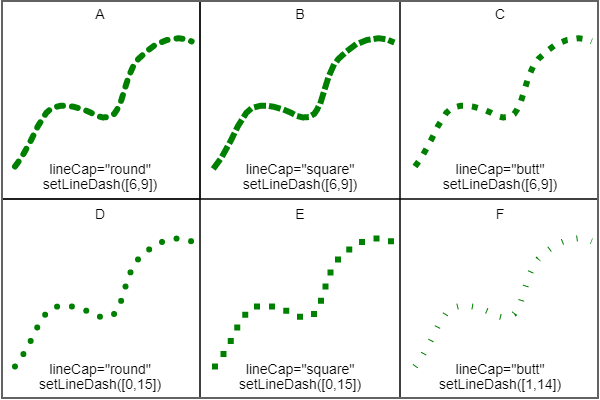
Dotted lines
Drawing dashed lines is relatively straightforward. On the other hand, drawing dotted lines requires a bit more attention to detail. The key is to understand the ramification of assigning "round" or "square" to the lineCap property. Both of these will add ½ the line's width to both sides of every dot. So in order to get perfectly circular dots (or perfectly square dots) the first integer provided to setLineDash should be zero.
// Circular dots for a hiking trail
definePath(ctx, hikingTrailPts);
ctx.strokeStyle = 'Green';
ctx.lineWidth = 6;
ctx.lineCap = 'round';
ctx.setLineDash([0,10]);
ctx.stroke();

// Square dots for milestone markers every 5th dot
ctx.strokeStyle = 'Red';
ctx.lineWidth = 6;
ctx.lineCap = 'square';
ctx.setLineDash([0,50]);
ctx.lineDashOffset = -40;
ctx.stroke();
It's possible to draw "dots" as thin, tall, cross-lines that look like a boardwalk or railroad ties. The trick is to specify a lineWidth that is much wider than the setLineDash stroked value. This technique might also be used to draw tick-lines on a graph's axis. Here's an example showing a boardwalk:
// Boardwalk: line width 8, stroke width 1, gap width 4
definePath(ctx, boardwalkPts);
ctx.strokeStyle = 'Brown';
ctx.lineWidth = 8;
ctx.lineCap = 'butt';
ctx.setLineDash([1,4]);
ctx.stroke();
It's also possible to create line combinations with alternating dots and dashes by supplying setLineDash with additional pairs of integers as demonstrated here with an overhead high-power lines.
// High power line: 6 dashes / 1 dot for an overhead high-power line
definePath(ctx, highPowerLinePts);
ctx.strokeStyle = 'Black';
ctx.lineWidth = 1;
ctx.lineCap = 'round';
ctx.setLineDash([4,1,4,1,4,1,4,1,4,1,4,3,0,3]);
ctx.stroke();
One limitation of dots and dashes is that all of the sub-strokes are in the same color. To draw a multi-colored line, use any of the techniques already discussed two or more times sequentially, reusing the already defined path. The hiking trail example above, with green circular dots overlaid with red square milestone markers, demonstrates this concept.
Stroke overlays
With the basics covered, we can move on to lines that are constructed through layering. Happily, there's not much to it.
Overlays are simply two or more strokes that follow the same defined path, so the script goes like this: 1) define the path, 2) set context property values for the underlay and call stroke, 3) set context property values for the overlay and call stroke again. Here are a few recipes to demonstrate the idea.
First, a high-speed rail line represented as a thick solid line overlaid with wide transparent dashes.
// High-speed rail underlay
definePath(ctx, highSpeedRailPts);
ctx.strokeStyle = 'SteelBlue';
ctx.lineWidth = 6;
ctx.setLineDash([]);
ctx.stroke();

// High-speed rail partially transparent overlay
ctx.strokeStyle = 'rgba(176, 196, 222, 50%)';
ctx.lineWidth = 4;
ctx.setLineDash([24,24]);
ctx.stroke();
Next, an administrative border, seen as a wide swath of transparent gray with a thin dash-dash-dot overlay.
// Administrative border transparent gray underlay
definePath(ctx, administrativePts);
ctx.strokeStyle = 'rgba(127, 127, 127, 50%)';
ctx.lineWidth = 14;
ctx.setLineDash([]);
ctx.stroke();

// dash-dash-dot overlay
ctx.strokeStyle = '#ccc';
ctx.lineWidth = 1;
ctx.lineCap = 'butt';
ctx.setLineDash([9,3,9,3,3,3]);
ctx.stroke();
Finally, a divided highway, seen as two thin black edges, two thick yellow lanes, and one thin gray middle divider. This is assembled using three strokes instead of two.
// Divided highway
definePath(ctx, dividedHighwayPts);
ctx.setLineDash([]);
ctx.strokeStyle = 'Black';
ctx.lineWidth = 7;
ctx.stroke();
ctx.strokeStyle = 'Yellow';
ctx.lineWidth = 6;
ctx.stroke();
ctx.strokeStyle = 'Gray';
ctx.lineWidth = 1;
ctx.stroke();
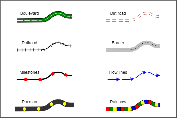
Overlays are limited only by your creativity. Here are some possibilities to spark your imagination:
Source code
All of the source code for Figures 1 through 4 are online as live HTML canvas drawings for you to study.
Figure 1 Symbolic cartography using lines
Figure 2 Effect of miterLimit on acute angles
Figure 3 Effect of lineCap on dots and dashes
Figure 4 Using overlays to assemble sophisticated lines
Recap
Complex data visualizations are possible with nothing more than HTML canvas and JavaScript. Here we've covered how to create a <canvas> element and get its programming context; how to define paths and subpaths; how to change line width and color; how to fine tune segment junctures and endpoints; how to draw arrowheads; how to draw dashed and dotted lines; and how to use overlays to assemble sophisticated lines.
Getting started with canvas based visualizations is fun and rewarding. Not covered here, but certainly worthy of future tutorials are: brushes, patterns, gradients and Bézier curves. Stay tuned.


